Bala Food Company
Graphic Designer
UC Davis Capstone Course
8 weeks
Bala Food Company is a Taiwanese brand that aims to introduce the unique tastes of dried guava to travelers that come in and out of Tao Yuan Airport. Dried guava, also known as “bá là gan (芭樂乾)”, is a tasty and healthy snack that is very popular among the people in Taiwan. The goal of the project is to transform the snack and its packaging into a product serves as a tasty treat and a fond memory of Taiwan.
Products Created: Brand Identity (logo, business system, graphic standard), Marketing Materials, Packaging Design, Photography, Process Manual
🛠️ Tools:
Adobe Illustrator, Adobe Photoshop, Adobe InDesign, Adobe After Effects
Logo Development
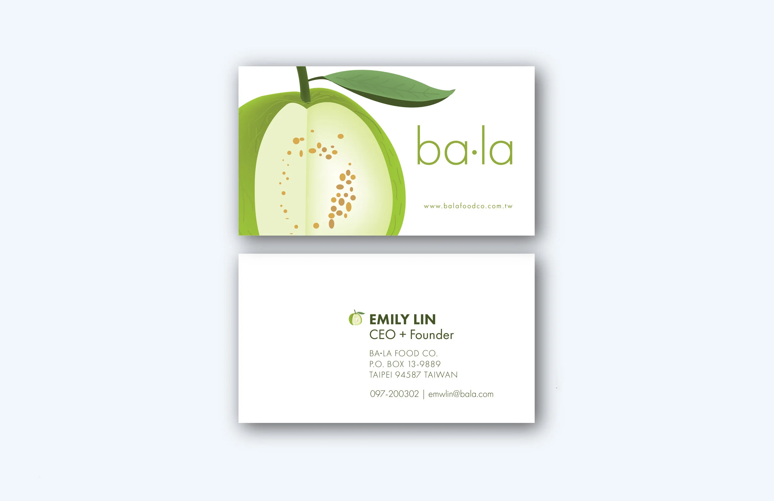
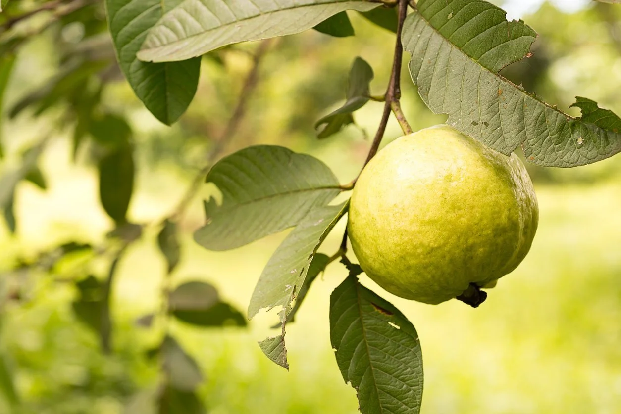
The logo was inspired by the (white) guava fruit itself. Initially, I wanted to create a minimal-type icon for the logo; however, my early logos started to look like either kiwis, pears, or apples. Therefore, I took advantage of my drawing background and vectorized/illustrated a cut-opened white guava fruit. Since the icon was more explicit, I utilized the pronunciation of "ba la" as the name of my product rather than using "guava."
Business System
Marketing Materials
I intended for this product to sell in Duty Free Shops in airports, so many of its marketing campaigns need to drive the customers in that direction.
Packaging Development
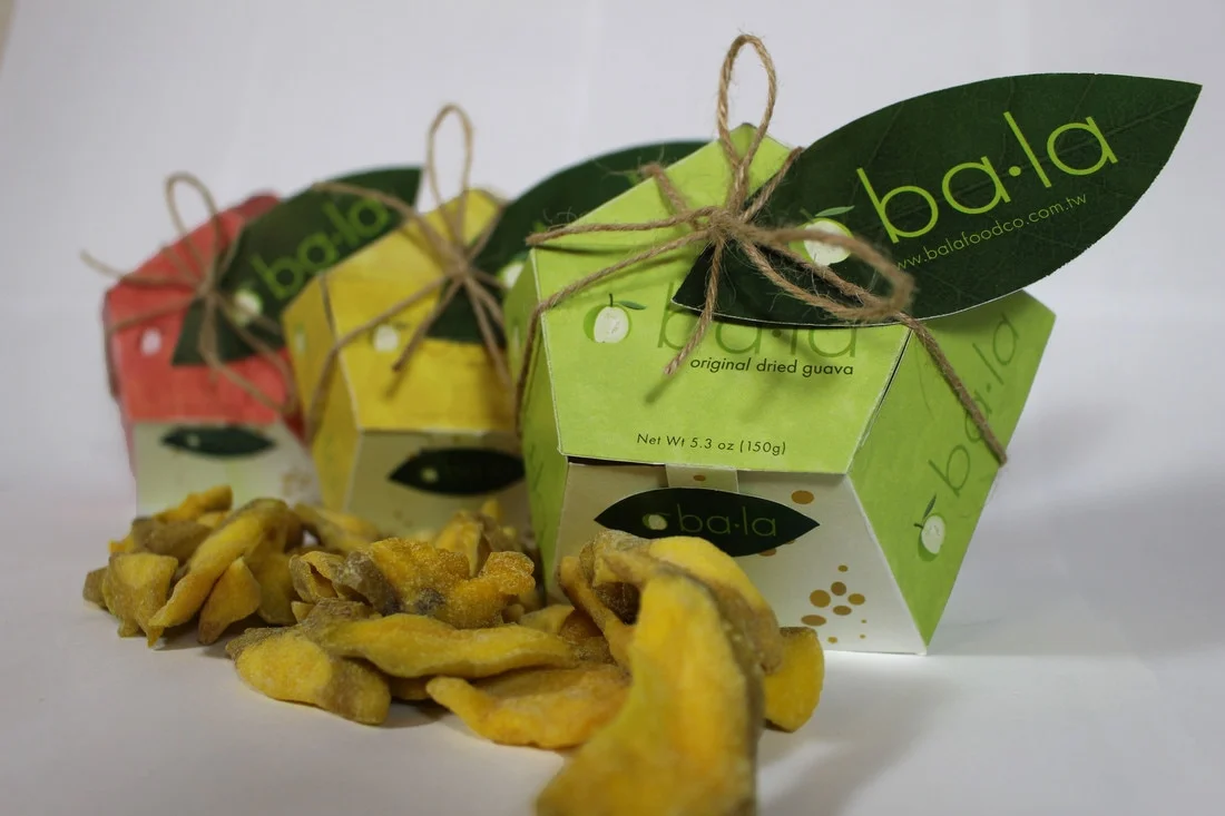
The goal of this project is to introduce the white guava fruit (because most people only know pink guavas.) With that in mind, my biomimicry is based off of the guava fruit itself. I wanted to create a packaging that will not only conveniently hold the dried guava snack, but also aesthetically pleasing enough to be a souvenir that represents a "Taste of Taiwan." The problem with most packaging designs is resealing, especially for this product that will be stowed away as a carry-on.
The idea of the original packaging is to create a replica of the fruit cut open (similarly to the logo) to show the white insides. I started reflecting on the geometric shapes and prisms I played with as a child. Through many trials of researching and designing mockups for the packaging, I stumbled upon sketching the draft the packaging I ended up using.


